The style I seem to gravitate towards is all about big, flat shapes. Colors are big and bold, and offer strong shape language.
However, putting single-colored triangles down on a page sometimes can look cold, or it can make things too abstract to be fun.
Let’s take a look at an example of how a tree was designed.
I first put down the most basic shapes of what I’m making. Sometimes it helps me to break something down to it’s simplest elements.

Ah, there we go! A tree. A green triangle and a little brown trunk. I think everyone would know what this is, even at this level. Now, sometimes less detail is great for things like backgrounds or less focal elements of your levels. I want the trees to set the natural mood of the stage, so I’m going to need a little more detail. Let’s add some layers.

We’ve now got layers of the tree to add some dimension. I’ve kept the integrity of the triangular shape in place, but it’s still a very large solid shape of color. Let’s add some interest by playing with alternating colors.

This is pretty interesting! The alternating green colors help show that the bottom layers are tucked inside of the upper layers. However, the sharpness of the triangles are a little off-putting for me. Let’s soften them up.

All we did was round out the pointed corners a bit, and it’s already looking a little more friendly. As I’m looking at the tree more, I’m becoming less satisfied with the level of detail. I’d like to show that the tree has lots of little fluffy branches, but I don’t want to lose the strong silhouette of the shape. Right now, the detail is defined by the alternating green colors… but I have another idea.

Now this was a big change! I used a stroke of the darker green to show details between the layers. I also added another layer to the tree! I think this design is the best iteration of the tree so far. It has strong shape language, enough detail with the stroke, and the color difference between the trunk and leaves show us that there are two separate forms here. The last step that I like to do is adjust the colors.

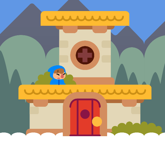
I’ve turned the saturation way down and moved the colors in a more “cool” direction. I figure this kind of tree would be present on a mountaintop or forest, so there’ll naturally be more cool colored themes going on there.
…and that’s pretty much it! I start with big shapes and keep refining until I’m satisfied. While my style may change and shift, you can see this overall process in everything I create. Start simple, then add the details while keeping the original idea in-tact.